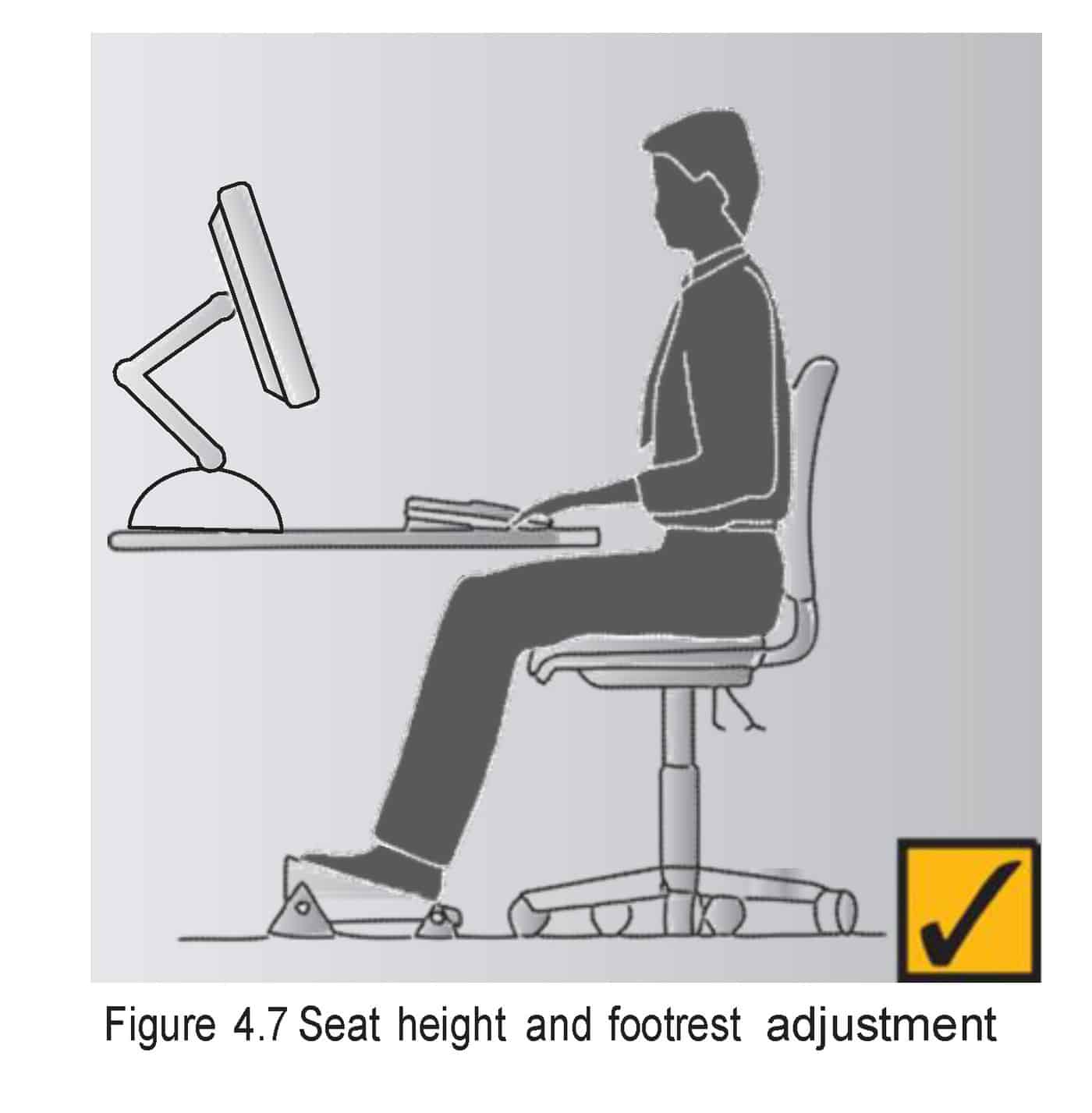
 A diagram of safe posture at modern workstations has become iconic but it has also become a symbol of ergonomic misunderstanding. There are assumptions behind the angular figure about the way modern workers work, the equipment used and the tasks undertaken.
Too often images, such as the one included here, are taken out of context. The image is used as a shortcut to what is considered the “correct” way to sit. The context, the risk assessments, the tasks undertaken, the location of the workstation – basically all of the OHS information included in the workplace safety guides is ignored. People think “the picture has a tick of approval, so why read when the picture says enough”?
This week Steelcase, a one hundred year old company that originally constructed waste paper baskets, launched its Gesture chair. The marketing of this chair is based on the discovery (?) of nine new postures in the workplace:
Continue reading “Lovely chair that helps greatly but is only part of the solution”


 The iPad, and many other devices, are bound by a