Better mental health context image

[Originally published on December 1, 2020]

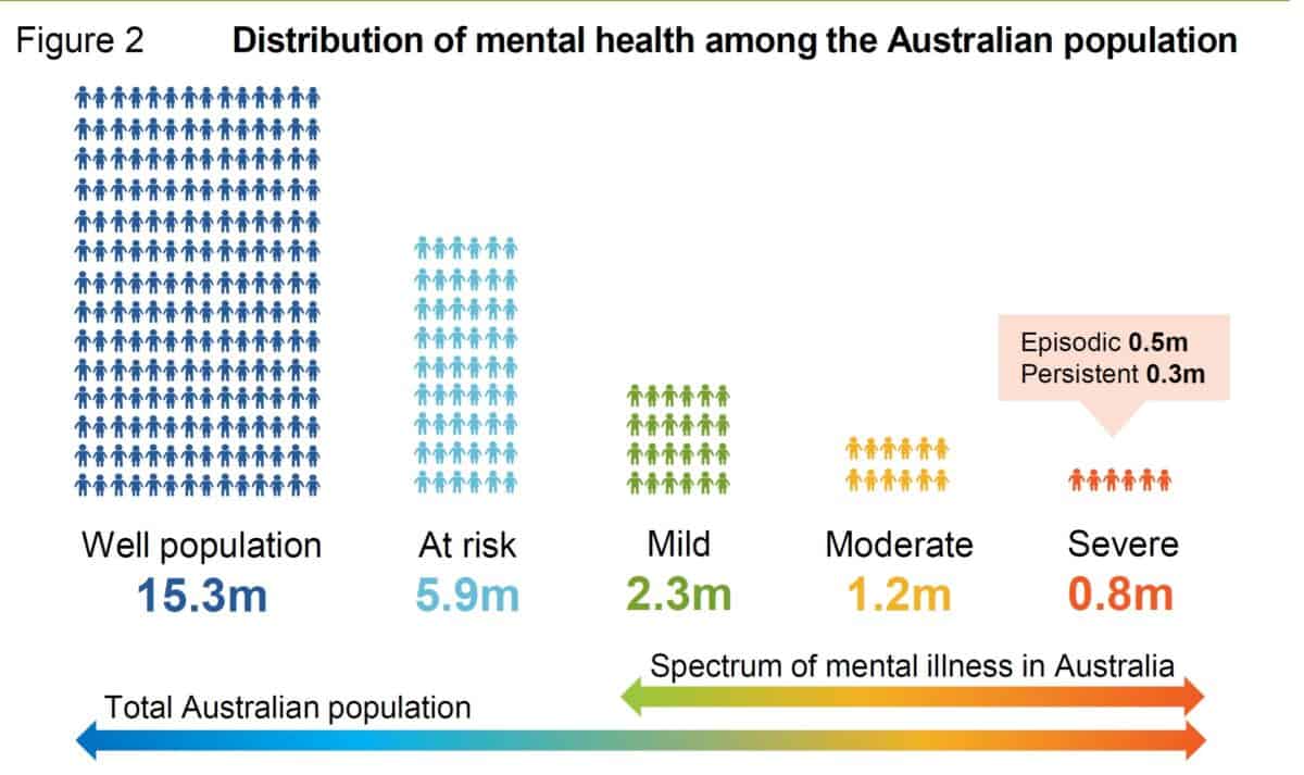
Last week, I wrote about the misrepresentation of mental health in a common graphic about the “mental health spectrum”. If only I had had time to read the Productivity Commission’s report into its inquiry on mental health. On page 10 is this image which provides a more accurate context for mental health in Australia.

Continue reading “Better mental health context image”

The never-ending line between healthy and sick

Infographics are increasingly used to summarise sometimes quite complex reports about occupational health and safety (OHS) matters. But often the nuance of the facts being depicted are stripped away in the translation process. There is one graphic that is repeatedly used in the context of mental health that seems to misrepresent reality for the sake of clarity.

Login or subscribe to SafetyAtWorkBlog to continue reading.

Advertorial over-simplifies workplace health and safety

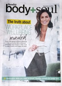
On Sunday November 4 2018, The Herald-Sun newspaper’s regular Body & Soul supplement devoted several pages to an exclusive article about workplace wellbeing ($). It is clearly an advertorial as the supplement has several full page advertisement from Medibank Private and the article includes a text box labelling it as the

“b+s 2018 Worklife Survey in partnership with Medibank”.

The article and survey is less than helpful from an occupational health and safety (OHS) perspective as there is no mention of organisational control measures or even the recent campaign in National Safe Work Month by WorkSafe Victoria on wellness!

Login or subscribe to SafetyAtWorkBlog to continue reading.

Robotics may cause an apocalypse if you’re male, old and low-skilled

Australia’s Office of the Chief Economist has released its first Industry Insights document for 2018.  This one focusses on flexibility and growth and included this statement in the chapter written by Andrew Charlton, a Director, of AlphaBeta :

“At the macroeconomic level, much of this change has been positive. The economy has created new jobs that are, on average, better paid, more satisfying and safer than the jobs that were lost.” (page 19)

Safer jobs? The last claim sent me to the source of the data – 

Login or subscribe to SafetyAtWorkBlog to continue reading.

Infographics still need some explanation

Infographics have become a popular format for distributing information about occupational health and safety (OHS) and other topics but they are often seen as a shortcut in consultation.  They can be visually engaging but are often too shallow as the writers and designers try to depict safety data in the simplest manner.  Terminology also needs to be consistent so that readability is most effective.

Recently Safe Work Australia produced

Login or subscribe to SafetyAtWorkBlog to continue reading.

Queensland’s workers’ compensation performance is “double plus good”

The Queensland Premier, Campbell Newman, called a “snap” election for the end of January 2015. On 11 January 2015, Newman tweeted:

“Queenslanders injured at work are covered by Australia’s strongest workers’ compensation scheme.”

This is a further example of political newspeak as what does a “strong” workers’ compensation scheme look like? Newman’s tweet included an image that provides some clarity to his claim.

LNP WC Twitter graphic Continue reading “Queensland’s workers’ compensation performance is “double plus good””

Concatenate Web Development
© Designed and developed by Concatenate Aust Pty Ltd