Infographics have become a popular format for distributing information about occupational health and safety (OHS) and other topics but they are often seen as a shortcut in consultation. They can be visually engaging but are often too shallow as the writers and designers try to depict safety data in the simplest manner. Terminology also needs to be consistent so that readability is most effective.
Recently Safe Work Australia produced an infographic about workplace mental health that illustrates some of these issues.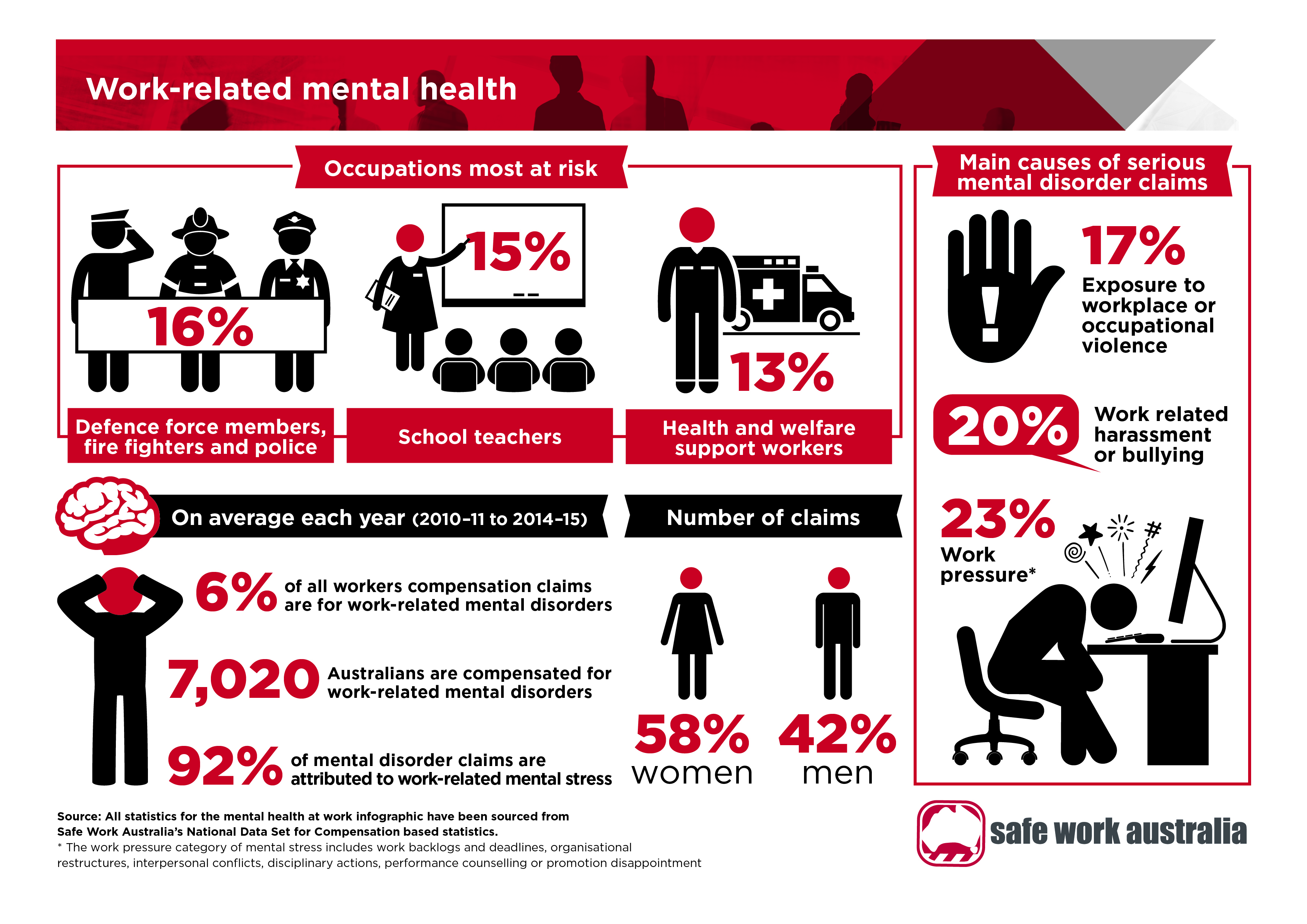
Comments are closed.