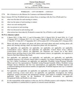
 According to Hansard, Western Australia’s Opposition Minister for Local Government, Tony Krsticevic put a Question on Notice to the Government about WorkSafe WA’s activities and meetings in relation to the City of Perth. The Council is currently undergoing an independent inquiry into its governance and workplace behaviours. The investigation is scheduled to take 12 months.
Krsticevic asked:

 February 2018 is an important month for the SafetyAtWorkBlog as it is the 10th anniversary of the blog’s operation and the 1st anniversary of our subscription service.
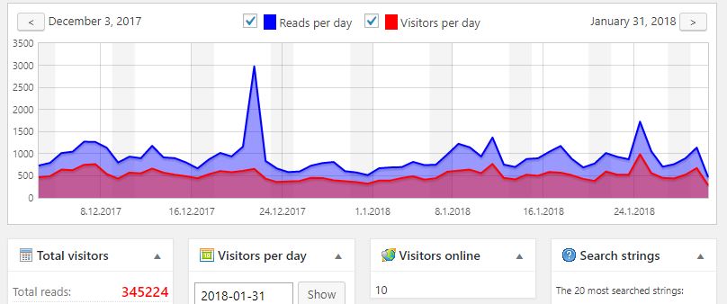 For those several thousand followers who don’t subscribe, I hope you appreciate the occasional free-access articles, the statistics certainly indicate there are plenty of you out there. Some basic stats for the SafetyAtWorkBlog in its first year of subscriptions include
 A crucial element in achieving the aims of the independent review into WorkSafe Victoria, as discussed in an